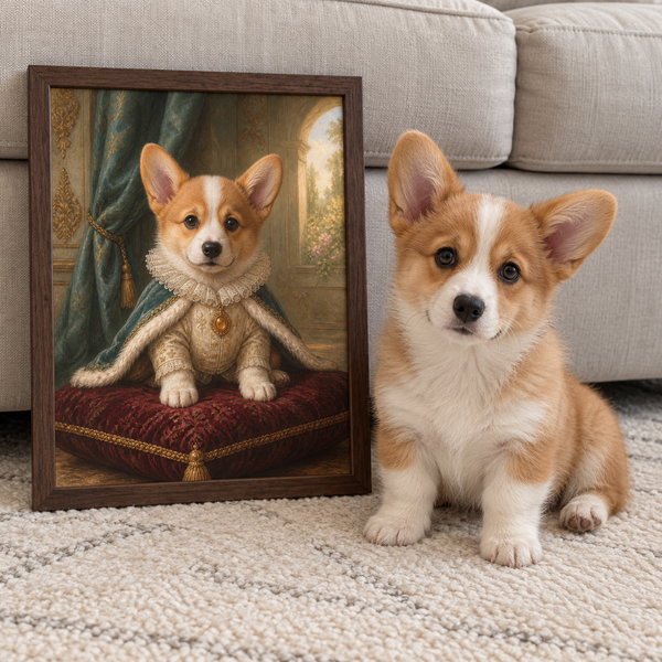
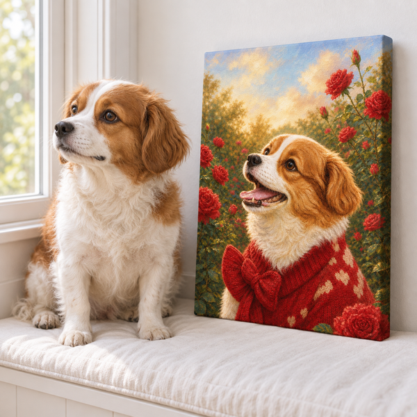
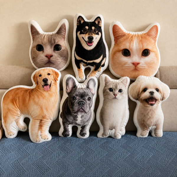

Dog pop art turns a familiar pet photograph into a bold, graphic image built around color, contrast, crop, and repetition. The style can feel playful, cinematic, or surprisingly polished—but only when the dog remains recognizable beneath the visual treatment.
The easiest way to plan a successful portrait is to make four decisions in order: choose the right photo, choose how tightly to crop it, choose the color relationship, and choose where the finished piece will live. Style comes after likeness, not before it.
What Makes a Dog Portrait Feel Like Pop Art?
Pop Art drew attention to the visual language of popular culture: repeated images, commercial printing effects, flat areas of color, graphic outlines, and subjects treated as icons. The Andy Warhol Museum’s icon portrait lesson uses repetition and color changes to show how one image can take on different moods. The Whitney Museum’s Roy Lichtenstein overview provides another entry point into the artist most associated with comic-inspired dots, outlines, and cropped scenes.
In a pet portrait, those ideas may appear as:
- a close crop that gives the face immediate presence;
- a limited palette with strong light-dark separation;
- unexpected background colors;
- repeated panels or color variations;
- simplified shapes that make the eyes, ears, nose, and markings read quickly;
- halftone-like texture or crisp graphic edges.
Not every colorful dog picture is Pop Art, and a portrait does not need every device at once. One strong idea is usually enough. A clean close-up against an energetic color field can feel more confident than an image combining dots, text, frames, splashes, and multiple filters.
Choose a Photo That Can Survive Simplification
Pop Art often removes subtle tonal information. That makes the source photo especially important. If the eyes are already hidden, the face is blurry, or the ears disappear into a dark background, stronger colors will not restore the missing detail.
Look for a photo with:
- Clear eyes. Catchlights and visible eye shape help carry personality.
- A readable silhouette. Both ears, the top of the head, and the muzzle should be easy to separate from the background.
- Even facial light. Strong backlight can turn an expressive face into a dark shape.
- Natural proportions. An extreme wide-angle phone photo can enlarge the nose and shrink the head.
- A familiar expression. The technically sharpest photograph is not always the one that feels most like your dog.
You do not need a studio image. A phone photo taken near a window can work beautifully if it is sharp and evenly lit. Avoid screenshots downloaded from social media when the original file is available; compression leaves less information for cropping and printing.
Pawfolio’s dog portrait photography tips cover eye-level angles, attention cues, background control, and timing if you want to take a new source photo.
Pick the Crop Before the Colors
Cropping determines the portrait’s energy. A head-and-shoulders crop puts expression first. A full-body crop includes posture and markings but asks the dog to share more space with the background. A very tight face crop can feel dramatic, though it may remove ears or breed-defining features.
Ask what people recognize first about this dog. For a corgi, the ears and smile may matter. For a greyhound, the long neck and profile may be essential. For a dog with a heart-shaped nose patch, a close frontal view may tell the story immediately.
Leave enough space around important features. If the photo ends exactly at the ear tip, the final design has no room to adjust. If a collar, tag, or bandana is emotionally significant, decide whether it should stay before the artwork is prepared.
For portraits with two or more dogs, do not assume one shared snapshot is required. Pawfolio’s guide to combining separate pet photos explains how angle, eye line, lighting, and apparent size affect a believable group composition.
Build a Color Relationship, Not a Random Rainbow
Bold color works best when the palette has a clear relationship. Start by deciding whether the portrait should blend with the room, energize it, or become the main focal point.
Complementary contrast
Colors opposite one another on the color wheel create immediate tension: blue with orange, purple with yellow, or red with green. The result can feel lively and poster-like. Use one color as the main field and the other as an accent so they do not compete equally everywhere.
Analogous color
Neighboring colors—such as blue, teal, and green—feel more connected. This is useful when you want contemporary color without a loud clash. A warm analogous palette of red, coral, and orange can feel energetic; a cool palette can feel calm and graphic.
Room-led palette
Pull one color from the rug, chair, artwork, or textiles already in the room. The portrait does not have to match everything. Repeating one accent color is often enough to make a bold piece feel intentional.
Dog-led palette
Let the coat guide the contrast. A black dog can stand out against coral, turquoise, pale yellow, or another lighter field. A cream dog may need a deeper background and a visible outline. For more detail on preserving dark fur, use this guide to photographing black pets.
Skin tone, wall color, and screen brightness can all affect how digital color appears. If a proof is provided, review it on more than one screen and in the room where the finished piece will hang.
Decide How Graphic You Want the Final Portrait
There is a spectrum between a realistic painted portrait and a highly graphic image. Pop art pet portraits can sit anywhere along that spectrum.
- Light graphic treatment: recognizable fur texture, simplified background, stronger contrast.
- Moderate treatment: flatter shapes, bolder outlines, limited palette, selective detail.
- High graphic treatment: extreme color replacement, repeated panels, halftone texture, and a very tight icon-like crop.
Choose based on what you want to preserve. If the dog’s coat pattern is central to their identity, keep enough tonal detail to show it. If the ears and expression do most of the work, a flatter treatment may still feel unmistakably personal.
Text is another choice. Names, dates, and slogans can date a piece quickly or compete with the face. If you include words, keep them short, verify spelling, and make sure the design still works when viewed from across the room.
The Tate’s Andy Warhol exhibition guide is useful for seeing how photographic source material, repetition, color, and print processes can change the emotional temperature of a familiar image. Use it for visual understanding, not as a template to copy a specific artwork.
Match the Artwork to Its Display Location
Pop Art likes space. A saturated portrait can become the focal point even at a moderate size, while a small piece may work better on a shelf or within a mixed gallery wall.
Before ordering, photograph the wall straight on and note:
- available width above the furniture;
- viewing distance;
- nearby patterns and artworks;
- direct sunlight or glare;
- whether the room already has one dominant accent color.
A single portrait above a desk can use a tighter crop and quieter palette. A living-room piece can handle broader color fields. In a gallery wall, repeat one frame color or one accent hue to connect the new work with the existing group.
If you are deciding between print formats, Art Print vs. Canvas for pet portraits compares room placement, framing, texture, and visual weight.
A Five-Step Brief for Your Dog Pop Art Portrait
You can turn all of these choices into a simple creative brief:
- Photo: identify the exact original file and what makes the expression recognizable.
- Crop: state whether ears, chest markings, collar, or another feature must remain visible.
- Palette: choose one dominant color relationship rather than a long list of favorites.
- Graphic level: decide how much fur texture and natural coloring you want to keep.
- Placement: provide the room, wall color, and approximate display size.
The modern pet portraits from Pawfolio Art offer bold contemporary directions made from a pet photo, including colorful and cinematic designs. Review the proof for likeness first—eyes, ears, markings, and expression—then judge the palette in the context of your room.
The strongest dog Pop Art does not make the pet anonymous. It uses graphic choices to make the familiar details feel larger, clearer, and more joyful. When the photo, crop, color, and placement all support one another, the result can be bold without losing the dog at the center of it.