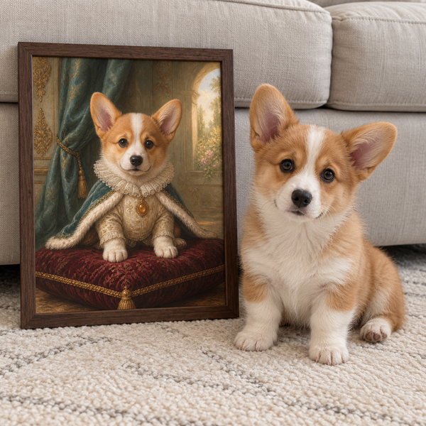
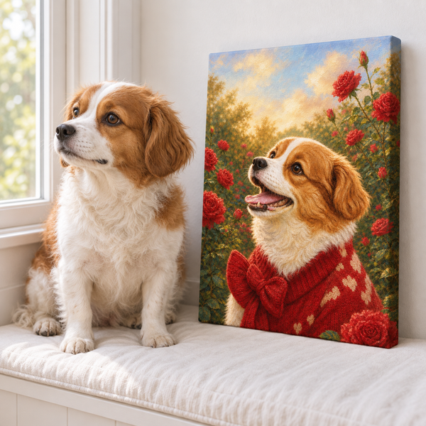
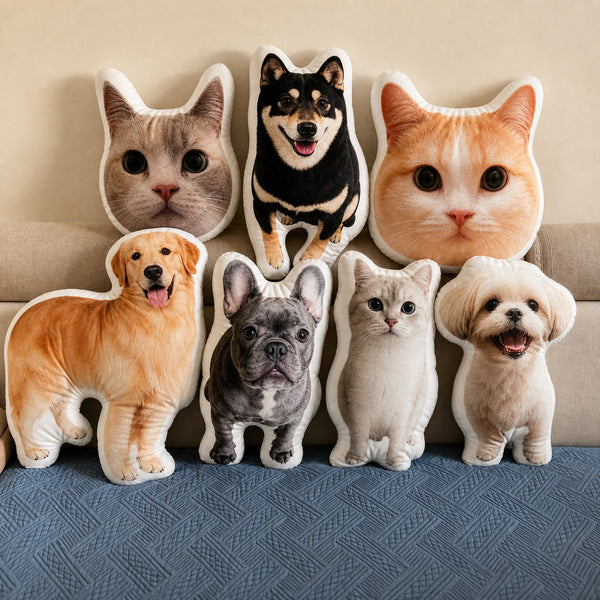

Modern pet portraits work best when they feel like part of the room and unmistakably like the animal you know. That balance is more useful than chasing a trend. A bright graphic treatment may suit a playful hallway, while a restrained portrait with strong negative space may belong in a quiet living room. Neither is automatically more modern. For practical placement examples, see these dog wall art ideas by room.
Instead of starting with a long menu of styles, make five decisions in order: room, pet, background, format, and scale. This room-first process helps you choose artwork that has personality without making the rest of your home feel like pet-themed decor.
Start with the room's visual language
Stand where you will normally see the artwork and describe the room in a few plain words. Is it warm and earthy, crisp and high-contrast, light and minimal, or colorful and collected? Then note the elements that already repeat: wood tones, black metal, soft upholstery, rounded shapes, or one strong accent color.
Your portrait does not need to match every cushion. It only needs one or two relationships with the room. A background can echo a wall color, a frame can repeat nearby hardware, or the artwork can provide one controlled contrast in an otherwise neutral space.
Try this quick test:
- Photograph the wall in daylight.
- Mark the approximate artwork area with painter's tape.
- View the wall from the room's main entrance and usual seating position.
- Decide whether the space needs calm, contrast, warmth, or humor.
That last word becomes a better style brief than “make it modern.” It describes the job the artwork needs to do.
Preserve the features that make your pet recognizable
A contemporary treatment can simplify a background or intensify color, but it should not erase the details that make the subject feel specific. Before choosing a style, list three recognizable traits: perhaps a white blaze between the eyes, one folded ear, a square muzzle, an alert posture, or a habitually skeptical expression.
Choose a source photo where those traits are visible. Pawfolio's pet photo guide recommends clear lighting, focus, useful framing, and visible facial details. A style cannot recover an eye hidden in shadow or an ear cropped out of the original image with complete reliability.
Also decide how much of the pet belongs in the composition:
- A head-and-shoulders crop creates a direct, graphic focal point.
- A chest-up view preserves markings and posture without requiring a large wall.
- A full-body pose can show scale, stance, tail, or a favorite sitting shape.
- A multi-pet composition needs enough space for each face to remain readable.
The crop should serve both recognition and room scale. A tiny full-body figure may disappear above a sofa, while an extreme close-up may feel too intense in a narrow hallway.
Choose the background by visual weight
Background choice changes how formal, playful, or quiet a portrait feels. It also determines whether the piece blends into the room or becomes the main accent.
A simple solid or softly textured background usually creates the cleanest modern result. It gives the eyes, ears, and silhouette room to lead. A bolder graphic background can work when the room has enough visual calm around it. Scenic elements add story, but they also add detail, so they need more viewing distance.
Use the room as a limit, not a template:
- In a minimal room, choose restrained shapes and one controlled color relationship.
- In an eclectic room, a stronger palette can join the existing layers without becoming clutter.
- In a small workspace or bedroom, softer contrast may feel easier to live with at close range.
- In a hallway, a clear silhouette can read quickly as people pass.
If you are unsure, compare a quiet and a bold option before deciding. Pawfolio's pet portrait background ideas explains how simple, personal, and scenic backgrounds change the final effect.
Match the format to the finish you want
Style and physical format are separate decisions. The same modern artwork can feel different as an Art Print or as a gallery-wrapped Canvas.
An Art Print has a flatter presentation and can be integrated with the frame style used elsewhere in the room. It works well when you want a crisp gallery-wall relationship or the option to coordinate frame finishes. A gallery-wrapped Canvas has visible depth and a more object-like presence on the wall. It can suit a single statement piece where the artwork should feel substantial without an external decorative frame.
Pawfolio keeps these categories distinct: an Art Print is not a Canvas, and a Canvas is built around a solid-wood inner frame. The Art Print vs Canvas decision guide compares the formats in more detail.
Think about light as well as appearance. Reflections, strong daylight, and placement near a heat source can change how comfortable a piece is to view and how materials age. The Library of Congress recommends limiting light exposure for photographic materials. For any displayed artwork, avoid a position where harsh direct sun falls across it for long periods.
Test scale before ordering
Many otherwise good portraits feel wrong because the artwork is too small for the wall or too large for the viewing distance. Online thumbnails make scale difficult to judge, so test the footprint in the real room.
Painter's tape or a sheet of kraft paper works well. Mark the outer dimensions, step back, and look from more than one angle. Include nearby furniture in the decision. A portrait above a console should relate to the console; a piece on a picture ledge should leave room for the objects around it.
Ask four questions:
- Can I read the pet's expression from the normal viewing position?
- Do its proportions sit comfortably with the nearby furniture?
- Is there enough blank wall around the piece to let it breathe?
- Will the portrait still work if nearby accessories change?
For a gallery wall, print a paper placeholder and test it among the other frames. Consistency can come from frame color, spacing, or palette; every subject does not need to match.
Build one clear creative brief
Before placing an order, reduce the decisions to one sentence: “A calm, chest-up portrait of my gray cat with a warm neutral background for a small home office,” for example. That sentence identifies mood, crop, subject, background, and location without prescribing every artistic detail.
Then collect the practical inputs:
- one strong primary photo;
- extra photos only when they clarify markings or color;
- the room photo and approximate wall size;
- the traits that must remain recognizable;
- your preferred background direction;
- the chosen Art Print or Canvas format.
An artwork proof is the moment to check identity, crop, color balance, and obvious details—not to redesign the room after the piece is made. Keeping the brief clear makes that review easier.
Modern pet portraits do not need to look anonymous to feel sophisticated. The strongest choice usually combines a recognizable pet, one deliberate relationship with the room, and enough restraint for the artwork to remain enjoyable after today's accessories change. Explore Pawfolio's Modern Art Prints when a clean, frame-friendly format fits that plan.