
You have a favorite pet photo and several saved portrait examples, but each example appeals to you for a different reason. One has beautiful color. Another catches an expression you recognize. A third would make an excellent birthday surprise. Choosing becomes easier when you stop asking one picture to satisfy every possible goal.
To work out how to choose a pet portrait style, define what matters most, compare two candidates against that priority, and check what the finished product actually includes. The exercise below helps you turn a collection of appealing images into a decision you can explain—and useful notes for the artwork itself.
Write one sentence that defines a successful portrait
Before browsing another gallery, complete this sentence: “I want this portrait to feel _____, and I would be disappointed if _____.” Your answer might be “playful, and I would be disappointed if the costume distracted from her uneven ears.” Or it might be “quiet, and I would be disappointed if the colors were much brighter than the photograph.”
These are hypothetical preferences, not rules about what a pet's personality requires. A lively dog does not need neon colors, and a dignified cat does not need a throne. Your preference can come from the room, a memory, or the person receiving the portrait.
Now identify one detail that must survive any change in style. It could be a white eyebrow, a broad muzzle, an unusual ear position, or the shape of a familiar smile. Choose something specific enough to check later.
Keep this sentence beside your saved examples. It gives you a reason to remove an attractive option: “I love the dramatic background, but it works against the gentle feeling I wanted.” That is a useful decision, even when the rejected picture is beautiful.
Compare the treatment, not just the style label
Style names are a starting point. Two designs described as modern can differ considerably in color, detail, and composition. Look at what each example actually does to the subject.
- A realistic treatment keeps attention on observed proportions, shading, and markings. Consider it when small facial details matter to your choice.
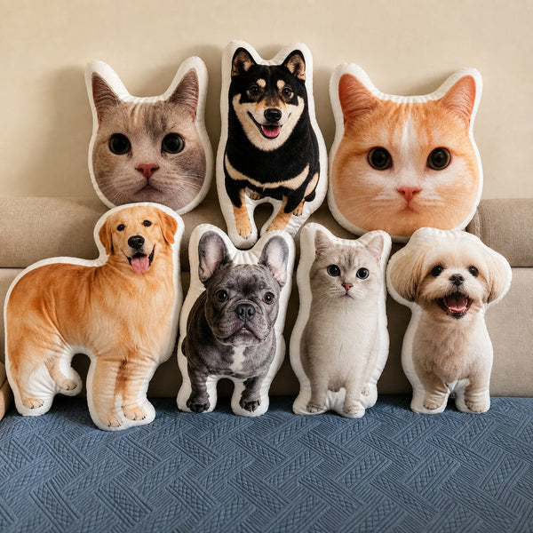
- A graphic treatment simplifies shapes or uses flatter areas of color. Check which details remain visible after that simplification.
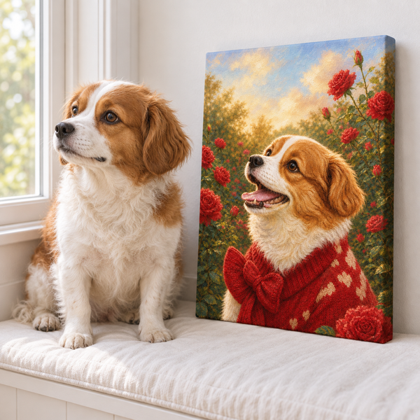
- A watercolor-inspired treatment may use softened edges and transparent-looking washes. Look for an example where the eyes and important markings remain distinct.
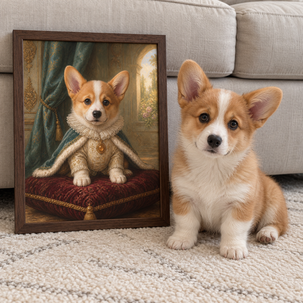
- A royal or character treatment adds clothing and a setting. Decide whether that imagined scene adds something you want to live with.
These descriptions concern appearance. A watercolor-inspired image can be digitally created and printed; the name alone does not establish that you are buying an original painting. Similarly, a painted-looking surface in a photograph does not prove there are raised brushstrokes on the object.
Getty's explanation of the elements of art distinguishes physical texture from texture suggested visually. It also separates a color's hue, lightness or darkness, and intensity. Those distinctions give you more useful language than “make it artistic”: you can ask for softer edges, lighter surroundings, or less intense color.
Run a two-option pet portrait style comparison
Choose just two finalists. Use your own pet photo beside both examples, while remembering that an example featuring another animal cannot show exactly how yours will look. Compare similar views where possible; a full-body scene and a close-up head portrait introduce more than one difference.
For each candidate, write “yes,” “unsure,” or “no” beside these questions:
- Does its overall feeling match my success sentence?
- Can I see how my must-keep feature would remain clear?
- Do I like the treatment of the face as much as the surrounding design?
- Can my reference photo supply the details this composition needs?
Treat an “unsure” as a question to resolve, not a point to average away. If you cannot tell whether a pale chin would disappear into the background, ask about that specific detail. If your only photo crops off an ear, choose another reference or request a photo assessment before assuming the missing part can be recreated accurately. Our photo checklist helps with that review.
Here is a hypothetical tradeoff: you prefer the color in a graphic example, but the softer example leaves more room for your dog's gray muzzle. Keep the feature you named as essential, then ask whether the preferred color can work within that treatment. Confirm available changes before ordering.
Give both finalists the same room test
Place the two examples beside a photo of the intended wall. Keep their displayed sizes similar so a larger preview does not win simply by being easier to see. This is a rough planning aid; a screen preview cannot guarantee the color of a finished print.
First, notice where your attention goes. Is it the pet's expression, a bright patch behind the head, or the costume? Getty describes visual emphasis as the part of a design that attracts attention, often through contrasts in color, size, shape, or texture. Apply that idea to your own goal: if the face matters most, check whether it receives the attention you want it to have.
Next, consider the surroundings without demanding a perfect match. You might prefer a portrait that introduces a new color or one that stays close to the room's existing palette. Both are valid choices. Try describing the relationship you want: “a quiet addition above the desk” or “the first thing you notice in the entryway.”
If the style feels right but the setting does not, explore our pet portrait background ideas. A background decision may resolve the problem without starting your entire search again.
Leave room for the recipient's preferences
When choosing a pet portrait as a gift, separate what you know from what you are guessing. You may know the recipient loves their cat and still have little evidence that they want a humorous costume portrait in the living room.
Look for specific clues they have already shared: a saved artwork, a favorite photograph, a preferred color, or the spot where they display family pictures. Avoid assuming that liking one funny pet video means liking every comic art style.
If two styles remain equally plausible, ask a small question that preserves much of the surprise: “Would you enjoy something colorful and playful, or something closer to your favorite photo?” Let the answer eliminate an option. For a remembrance gift, it can be especially useful to let the recipient choose the photo and tone rather than making those personal decisions for them.
Also distinguish the visual style from the physical presentation. At Pawfolio, an Art Print is a flat print on premium textured fabric; Canvas is stretched over a solid-wood inner frame with wrapped edges. Our Art Print and Canvas comparison explains the formats. Neither choice, by itself, tells you which visual style the recipient will prefer.
Turn the choice into a short design brief
Your pet portrait design brief can be six clear lines. Keep each line focused on one decision rather than sending a long list of conflicting inspirations.
- Main reference: identify the photo that should guide the pose and expression.
- Chosen treatment: name the selected design or give the exact example you mean.
- Feeling: repeat the word or phrase from your success sentence.
- Must-keep feature: describe the detail that matters most to you.
- Color or background: state the preference and ask what changes are available.
- Open question: identify anything that needs confirmation before you commit.
For example: “Use the seated photo. I prefer the softer treatment and a calm feeling. Please preserve the small white patch beside the nose. I like a pale green background; is that available with this design?” That is a hypothetical brief, but its specificity makes each request understandable.
When browsing Pawfolio’s custom pet portraits, use your brief to narrow the available designs. For Art Prints and Canvas, you review and approve the artwork before printing. Compare that proof with the same reference and must-keep feature you chose at the beginning.
You are ready to decide when you can name what you like, what you need preserved, and what still needs an answer. Keep those three points with your order notes so the final review follows the choice you actually made.