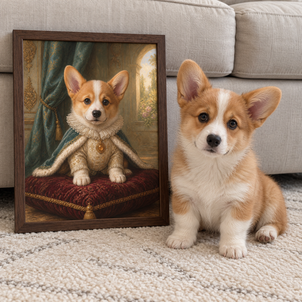
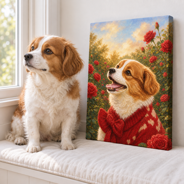

The most useful acrylic print vs canvas comparison does not begin with a list of which format is “better.” It begins with the wall. What light reaches it at noon? How close will people stand? Do you want a smooth, crisp surface or visible texture? Can the wall support the finished piece and its mounting system?
Those questions matter because acrylic and canvas change both the image and the room around it. A glossy surface can make contrast feel immediate, but it may also reflect a window. Canvas can make a photograph feel softer and more painterly, while its weave may reduce the visibility of very fine detail. Neither effect is automatically a flaw. The right choice is the one that serves the image in the space where you will actually see it.
First, Find Out What “Acrylic Print” Means
The name describes a category, not one universal construction. Some vendors print directly onto acrylic. Others print the image on photo paper and bond it behind a clear acrylic face. Backing materials, acrylic thickness, edge finish, surface coating, and hanging hardware also vary. Those choices affect the finished appearance, weight, reflections, and care instructions.
Before comparing prices, ask the seller five plain questions: Is the image printed directly on acrylic or face-mounted behind it? What forms the back of the piece? Is the visible surface glossy, matte, or treated to reduce reflections? What is the finished weight in the size you want? Which mount is included?
Canvas prints are easier to picture, but they vary too. The image is generally printed on woven material and stretched around a support frame. The depth of that frame, the tightness and texture of the fabric, the coating, the edge treatment, and the option of an outer frame all change the result. A thin, smooth canvas and a deeply textured gallery wrap should not be treated as identical products.
That is why an acrylic print vs canvas print decision should be based on the exact product specifications, not only the material named in a menu.
Compare the Surface Before You Compare the Color
Acrylic presents a smooth face between you and the image. With a glossy construction, dark tones and color transitions can feel clean and saturated. Small details remain visually separated when the source file and production quality are strong. This can suit photographs with crisp eyes, defined whiskers, fine architecture, or high-contrast graphic art.
Canvas adds a visible weave. Up close, that texture crosses the image; from farther away, it can give a photo the warmth of a painted object. Broad shapes, expressive brush effects, fur, clouds, and softer backgrounds often sit comfortably on it. Tiny lettering or extremely fine lines may be less at home because the surface itself becomes part of what you see.
Neither format can rescue a weak source image. Enlarging a small, compressed file does not create missing detail, and a reflective face does not repair an out-of-focus subject. If the artwork begins with a pet photo, choose a file with clear eyes, useful resolution, and an uncluttered view of the face. Pawfolio's photo guide for custom pet portraits explains what to look for before the artwork is made.
When possible, request close-up photographs or a sample that shows the surface in side light. A front-facing product mockup can hide both canvas texture and acrylic reflections.
Test the Wall in Daylight and After Dark
Room light is often the deciding factor. Stand where the artwork will hang and look toward that wall at the brightest time of day. Can you see a window, bright doorway, or ceiling fixture reflected in the spot? Return after dark and switch on the lamps you normally use. A glossy acrylic face can mirror those bright shapes, especially when the image contains large dark areas.
A specification-first guide to acrylic and canvas construction makes the same practical point: “acrylic print” may describe a face-mounted photograph, a direct print, or another layered build. The exact face and coating determine how the piece responds to light. Do not assume every acrylic print is equally reflective or that a product labeled “non-glare” looks the same as a glossy one.
Canvas has no clear face layer, so it usually reads more softly in mixed light. Its weave and any protective coating can still affect sheen, but a bright window is less likely to appear as a sharp mirror image. This often makes canvas easier to place in a sunny family room, a hallway with changing sight lines, or a bedroom where you want the art to feel quiet rather than luminous.
Try taping a sheet of paper to the wall in the intended size. Walk past it from the doorway, sofa, and closest viewing point. The exercise reveals more than a thumbnail: whether the size feels balanced, whether light crosses the surface, and whether the image will be seen head-on or at an angle.
Account for Weight, Mounting, and Everyday Care
Finished weight depends on size, thickness, backing, and hardware. Acrylic is often paired with a rigid back and a specific mounting system, so ask for the exact weight and installation instructions before ordering. Do not transfer a weight from another seller or a smaller example. Large wall art needs hardware suited to both the object and the wall material, especially above a bed, desk, or seating area.
Canvas is generally lightweight for its size because fabric is stretched over a frame. It may arrive ready to hang, but “ready” does not mean every hook or wall is appropriate. Check the supplied hardware, measure rather than eyeball, and follow the maker's guidance. If the canvas has a deep profile, remember that it projects farther from the wall than a flat product photograph may suggest.
Care is construction-specific too. Ordinary acrylic surfaces can attract dust through static and may scratch if rubbed with a rough cloth. Tate's review of art glazing options emphasizes that coatings, cleaning needs, reflections, static, and weight vary across products. It recommends soft wiping materials and following the appropriate cleaning method for the specific glazing. Use the seller's instructions rather than a generic cleaning shortcut.
For canvas, use the care directions supplied with the piece. Keep either format away from splashes, sustained heat, and harsh conditions the manufacturer does not approve.
Use a Simple Room-First Decision Matrix
Choose acrylic when the smooth clear face is part of the appeal, the image relies on crisp detail, and you have tested the wall for reflections. It can work especially well in a controlled-light room with a contemporary, polished feel. Confirm the construction and mount before treating two acrylic offers as equivalent.
Choose canvas when you want visible texture, a lighter visual mood, and an object that feels closer to a painting. It is a natural fit for expressive pet artwork, relaxed rooms, and walls where changing light would make a highly reflective surface distracting. Browse Pawfolio's custom pet canvas collection to see how different portrait styles translate to that format.
If you are undecided, rank these six factors from most to least important:
- reflections on the actual wall
- smooth detail versus textile texture
- finished size and viewing distance
- exact weight and mounting method
- care you are comfortable performing
- total price for the specified construction, not the category name
The ranking makes tradeoffs visible. A renter may put low weight and simple installation first. A collector with controlled lighting may care more about a clear face and fine detail. A family choosing a warm portrait for a busy room may prefer texture and a softer presence.
Choose the Pawfolio Format That Matches the Artwork
Pawfolio's wall-art choice is between its Art Print and Canvas formats, so acrylic research is most useful as a way to identify what you actually value. If you were drawn to acrylic for smooth detail, first look at custom pet Art Prints. If you were drawn to canvas for texture and a gallery-wrapped object, compare the Canvas option instead.
Our Pawfolio Art Print vs Canvas guide keeps that decision specific to the two formats available from Pawfolio. It covers their surface, presentation, room fit, and ordering considerations without pretending one belongs in every home.
Use the same room test either way. Check the light twice, mark the intended dimensions, view the wall from normal seats and doorways, and picture the artwork at the distance people will actually see it. Then choose the surface that supports the portrait instead of competing with it.
The best wall art is not the format with the loudest marketing claim. It is the piece whose surface, scale, and installation make sense every time you enter the room.